_jfif.jpg)
Our mission for this project was to create a mock store. In this store we had to create a logo, store design, tell what type of merchandise we will be selling, and create a store window display.
Our Concept
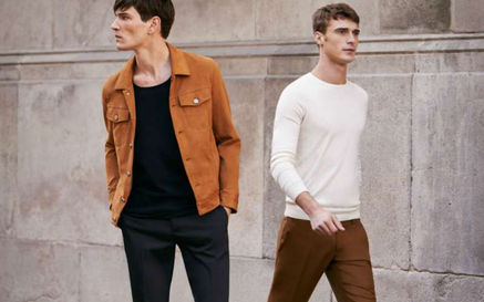
We are designing for a couples special occasion. Whether this occasion is an anniversary or date night. This store is for young couples age ranging from 23-30 years old, also this store is for men and women, to show that we are for all genders and we don’t focus on just one. This store is high end but with a causal feel.
Social Responsibility
The concept of our store as merchandisers will incorporate social responsibility by having a gender inclusive brand. If you were to walk into our store, you will see that we do not have gender sections. We would have unisex clothing because every gender is welcome into our store and we do not put a specific gender for our clothes because we understand now during these times that everyone doesn't identify with certain genders; we want our brand to show that we take notice and care for every person that would walk into our store.
Mood Board

Merchandise
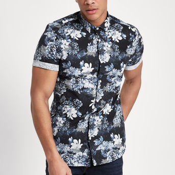
In our store we will be selling all types of clothing. We will sell men’s and women’s clothing, but since our store is about being inclusive of everybody we will not have our clothes section off by gender but by size, style, and garment. This will include pants, jeans, shirts, dress shirts, blouses, and suits. In our store will not sell accessories such as earrings, purses, or shoes. Our store strictly sells clothing only.
Packaging For Store

Stickers

Gold Marble Tissue Paper


Shopping Bags
Boxes
Store Exterior

Store Interior
-
Color for the walls: Burgundy
-
Color for the floor: Black marble print tile for the floors.
-
Music: Classical piano music
-
Scent: Fresh scent in our store like ocean breeze
-
These materials support our brand image and the atmosphere of our store in many ways because we want our store to feel and look luxurious which was our goal. These materials help us achieve this by keeping it simple but with the right elements such as quiet, calm music to give it a more high-end feel to the store. We also wanted our store to always look clean. Having a fresh scent will not be overpowering and will instantly give the customer a fresh and clean smell that goes with our organized store.


Store Interior Continued
Lighting
-
Yellow tone lights
-
Light Levels:
-
–Light Level (Foot Candles): 20-50 FC
-
–Light Level (LUX): 200-500 lux
-
–Lighting Power Density (Watts per SF): 1.59
-
-
Big Modern Chandelier in the middle of the store.
-
By the side of the walls we would have industrial track lighting in black color rods with yellow tone light bulbs as well.


Plano-gram

-
Red: Big Chandelier in the center of the store
-
Blue: Industrial Track Lighting by the wall shelving, window displays and by the checkout station highlighting our logo on the wall.
-
Green: Spotlight Ceiling Lights through out the store.
Directional & Informational Signing
-
By the checkout table we would have information about rewards programs, discounts, and other benefits for the customers.
-
Sale items would have special tags letting the customer know about the discount on that apparel item.
-
Directional signs would be only informing about where the fitting rooms are located.

Fixtures & Displays
-
Gold and wood nesting table to display apparel items
-
For tuxedos/suits and dresses we would have long gold racks.
-
Seating area
-
Small coffee table with gold accents and a glass top
-
Burgundy armchairs
-
These fixtures and displays facilitate both merchandise presentation and image because they all give off a high end feel but still comfortable. which is what our merchandise represent.


Plano-gram
Plano-gram using Visual Retailing


